Tag: Statistics

  • Guide SPSS how to: Measures of Central Tendency and Measures of Dispersion

    Here’s a guide for 1st year students to calculate measures of central tendency and dispersion in SPSS:

    Calculating Measures of Central Tendency

    1. Open your dataset in SPSS.
    2. Click on “Analyze” in the top menu, then select “Descriptive Statistics” > “Frequencies”
    3. In the new window, move the variables you want to analyze into the “Variable(s)” box
    4. Click on the “Statistics” button
    5. In the “Frequencies: Statistics” window, check the boxes for:
    • Mean
    • Median
    • Mode
    1. Click “Continue” and then “OK” to run the analysis

    Calculating Measures of Dispersion

    1. Follow steps 1-4 from above.
    2. In the “Frequencies: Statistics” window, also check the boxes for:
    • Standard deviation
    • Range
    • Minimum
    • Maximum
    1. For interquartile range, check the box for “Quartiles”
    2. Click “Continue” and then “OK” to run the analysis.

    Interpreting the Results

    • Mean: The average of all values
    • Median: The middle value when data is ordered
    • Mode: The most frequently occurring value
    • Range: The difference between the highest and lowest values
    • Standard Deviation: Measures the spread of data from the mean
    • Interquartile Range: The range of the middle 50% of the data.

    Choosing the Appropriate Measure

    • For nominal data: Use mode only.
    • For ordinal data: Use median and mode.
    • For interval/ratio data: Use mean, median, and mode.

    Remember, if your distribution is skewed, the median may be more appropriate than the mean for interval/ratio data.

  • Anova and Manova

    Exploring ANOVA and MANOVA Techniques in Marketing and Media Studies

    Analysis of Variance (ANOVA) and Multivariate Analysis of Variance (MANOVA) are powerful statistical tools that can provide valuable insights for marketing and media studies. Let’s explore these techniques with relevant examples for college students in these fields.

    Repeated Measures ANOVA

    Repeated Measures ANOVA is used when the same participants are measured multiple times under different conditions. This technique is particularly useful in marketing and media studies for assessing changes in consumer behavior or media consumption over time or across different scenarios.

    Example for Marketing Students:
    Imagine a study evaluating the effectiveness of different advertising formats (TV, social media, print) on brand recall. Participants are exposed to all three formats over time, and their brand recall is measured after each exposure. The repeated measures ANOVA would help determine if there are significant differences in brand recall across these advertising formats.

    The general formula for repeated measures ANOVA is:

    $$F = \frac{MS_{between}}{MS_{within}}$$

    Where:

    • $$MS_{between}$$ is the mean square between treatments
    • $$MS_{within}$$ is the mean square within treatments

    MANOVA

    MANOVA extends ANOVA by allowing the analysis of multiple dependent variables simultaneously. This is particularly valuable in marketing and media studies, where researchers often want to examine the impact of independent variables on multiple outcome measures.

    Example for Media Studies:
    Consider a study investigating the effects of different types of news coverage (positive, neutral, negative) on viewers’ emotional responses and information retention. The dependent variables could be:

    1. Emotional response (measured on a scale)
    2. Information retention (measured by a quiz score)
    3. Likelihood to share the news (measured on a scale)

    MANOVA would allow researchers to analyze how the type of news coverage affects all these outcomes simultaneously.

    The most commonly used test statistic in MANOVA is Pillai’s trace, which can be represented as:

    $$V = \sum_{i=1}^s \frac{\lambda_i}{1 + \lambda_i}$$

    Where:

    • $$V$$ is Pillai’s trace
    • $$\lambda_i$$ are the eigenvalues of the matrix product of the between-group sum of squares and cross-products matrix and the inverse of the within-group sum of squares and cross-products matrix
    • $$s$$ is the number of eigenvalues

    Discriminant Function Analysis and MANOVA

    After conducting a MANOVA, discriminant function analysis can help identify which aspects of the dependent variables contribute most to group differences.

    Marketing Example:
    In a study of consumer preferences for different product attributes (price, quality, brand reputation), discriminant function analysis could reveal which combination of these attributes best distinguishes between different consumer segments.

    Reporting MANOVA Results

    When reporting MANOVA results, include:

    1. The specific multivariate test used (e.g., Pillai’s trace)
    2. F-statistic, degrees of freedom, and p-value
    3. Interpretation in the context of your research question

    Example: “A one-way MANOVA revealed a significant multivariate main effect for news coverage type, Pillai’s trace = 0.38, F(6, 194) = 7.62, p < .001, partial η2 = .19.”

    Conclusion

    ANOVA and MANOVA techniques offer powerful tools for marketing and media studies students to analyze complex datasets involving multiple variables. By understanding these methods, students can design more sophisticated studies and draw more nuanced conclusions about consumer behavior, media effects, and market trends[1][2][3][4][5].

    Citations:
    [1] https://fastercapital.com/content/MANOVA-and-MANCOVA–Marketing-Mastery–Unleashing-the-Potential-of-MANOVA-and-MANCOVA.html
    [2] https://fastercapital.com/content/MANOVA-and-MANCOVA–MANOVA-and-MANCOVA–A-Strategic-Approach-for-Marketing-Research.html
    [3] https://www.proquest.com/docview/1815499254
    [4] https://business.adobe.com/blog/basics/multivariate-analysis-examples
    [5] https://www.worldsupporter.org/en/summary/when-and-how-use-manova-and-mancova-chapter-7-exclusive-86003
    [6] https://www.linkedin.com/advice/0/how-can-you-use-manova-analyze-impact-advertising-35cbf
    [7] https://methods.sagepub.com/video/an-introduction-to-manova-and-mancova-for-marketing-research
    [8] https://www.researchgate.net/publication/2507074_MANOVAMAP_Graphical_Representation_of_MANOVA_in_Marketing_Research

  • Data Analysis (Section D)

    Ever wondered how researchers make sense of all the information they collect? Section D of Matthews and Ross’ book is your treasure map to the hidden gems in data analysis. Let’s embark on this adventure together!

    Why Analyze Data?

    Imagine you’re a detective solving a mystery. You’ve gathered all the clues (that’s your data), but now what? Data analysis is your magnifying glass, helping you piece together the puzzle and answer your burning research questions.

    Pro Tip: Plan Your Analysis Strategy Early!

    Before you start collecting data, decide how you’ll analyze it. It’s like choosing your weapon before entering a video game battle – your data collection method will determine which analysis techniques you can use.

    Types of Data: A Trilogy

    1. Structured Data: The neat freak of the data world. Think multiple-choice questionnaires – easy to categorize and analyze.
    2. Unstructured Data: The free spirit. This could be interviews or open-ended responses – more challenging but often rich in insights.
    3. Semi-structured Data: The best of both worlds. A mix of structured and unstructured elements.

    Crunching Numbers: Statistical Analysis

    For all you number lovers out there, statistical analysis is your playground. Learn to summarize data, spot patterns, and explore relationships between different factors. It’s like being a data detective!

    Thematic Analysis: Finding the Hidden Threads

    This is where you become a storyteller, weaving together themes and patterns from qualitative data. Pro tip: Keep a research diary to track your “Eureka!” moments.

    Beyond the Basics: Other Cool Techniques

    • Narrative Analysis: Decoding the stories people tell
    • Discourse Analysis: Understanding how language shapes reality
    • Content Analysis: Counting words to uncover meaning
    • Grounded Theory: Building theories from the ground up

    Tech to the Rescue: Computers in Data Analysis

    Say goodbye to manual number crunching! Learn about software like SPSS and NVivo that can make your analysis life much easier.

    The Grand Finale: Drawing Conclusions

    This is where you answer the ultimate question: “So what?” What does all this analysis mean, and why should anyone care?

    Remember, data analysis isn’t just about crunching numbers or coding text. It’s about uncovering insights that can change the world. So, are you ready to become a data analysis superhero? Let’s get started!

  • Statistical Analysis (chapter D3)

    As first-year students, you might be wondering why we’re diving into statistics. Trust me, it’s not just about crunching numbers – it’s about unlocking the secrets of society!

    Why Statistical Analysis Matters

    Imagine you’re a detective trying to solve the mysteries of human behavior. That’s essentially what we do in social research! Statistical analysis is our magnifying glass, helping us spot patterns and connections that are invisible to the naked eye[1].

    Here’s why it’s so cool:

    1. Pattern Power: Statistics help us find trends in massive datasets. It’s like having X-ray vision for society!
    2. Hypothesis Hero: Got a hunch about how the world works? Statistics let you test it scientifically[4].
    3. Big Picture Thinking: We can use stats to make educated guesses about entire populations based on smaller samples. Talk about efficiency![4]

    The Statistical Toolbox

    Think of statistical analysis as your Swiss Army knife for research. Here are some tools you’ll learn to wield:

    • Descriptive Stats: Summarizing data with averages, ranges, and other nifty measures[4].
    • Inferential Stats: Making predictions and testing hypotheses – this is where the real magic happens![4]
    • Correlation Analysis: Figuring out if two things are related (like ice cream sales and crime rates – spoiler: they might be!)[2]
    • Regression Analysis: Predicting one thing based on another (useful for everything from economics to psychology)[2]

    Beyond the Numbers

    Statistics isn’t just about math – it’s about telling stories with data. You’ll learn to:

    • Interpret results (what do all those p-values actually mean?)
    • Use software like SPSS or R (no more manual calculations, phew!)
    • Present your findings in ways that even your grandma would understand

    Why You Should Care

    1. Career Boost: Employers love data-savvy graduates. Master stats, and you’ll have a superpower in the job market!
    2. Change the World: Statistical analysis helps shape policies and programs. Your research could literally make society better[1].
    3. Become a BS Detector: Learn to critically evaluate claims and studies. No more falling for dodgy statistics in the news!

    Remember, statistics in social research isn’t about being a math genius. It’s about asking smart questions and using data to find answers. So get ready to flex those analytical muscles and uncover the hidden patterns of our social world!

    Source Matthews and Ross

  • Chi Square

    Chi-square is a statistical test widely used in media research to analyze relationships between categorical variables. This essay will explain the concept, its formula, and provide an example, while also discussing significance and significance levels.

    Understanding Chi-Square

    Chi-square (χ²) is a non-parametric test that examines whether there is a significant association between two categorical variables. It compares observed frequencies with expected frequencies to determine if the differences are due to chance or a real relationship.

    The Chi-Square Formula

    The formula for calculating the chi-square statistic is:

    $$ χ² = \sum \frac{(O – E)²}{E} $$

    Where:

    • χ² is the chi-square statistic
    • O is the observed frequency
    • E is the expected frequency
    • Σ represents the sum of all categories

    Example in Media Research

    Let’s consider a study examining the relationship between gender and preferred social media platform among college students.

    Observed frequencies:

    PlatformMaleFemale
    Instagram4060
    Twitter3020
    TikTok3070

    To calculate χ², we first determine the expected frequencies for each cell, then apply the formula.

    To calculate the chi-square statistic for the given example of gender and preferred social media platform, we’ll use the formula:

    $$ χ² = \sum \frac{(O – E)²}{E} $$

    First, we need to calculate the expected frequencies for each cell:

    Expected Frequencies

    Total respondents: 250
    Instagram: 100, Twitter: 50, TikTok: 100
    Males: 100, Females: 150

    PlatformMaleFemale
    Instagram4060
    Twitter2030
    TikTok4060

    Chi-Square Calculation

    $$ χ² = \frac{(40 – 40)²}{40} + \frac{(60 – 60)²}{60} + \frac{(30 – 20)²}{20} + \frac{(20 – 30)²}{30} + \frac{(30 – 40)²}{40} + \frac{(70 – 60)²}{60} $$

    $$ χ² = 0 + 0 + 5 + 3.33 + 2.5 + 1.67 $$

    $$ χ² = 12.5 $$

    Degrees of Freedom

    df = (number of rows – 1) * (number of columns – 1) = (3 – 1) * (2 – 1) = 2

    Significance

    For df = 2 and α = 0.05, the critical value is 5.991[1].

    Since our calculated χ² (12.5) is greater than the critical value (5.991), we reject the null hypothesis.

    The result is statistically significant at the 0.05 level. This indicates that there is a significant relationship between gender and preferred social media platform among college students in this sample.

    Significance and Significance Level

    The calculated χ² value is compared to a critical value from the chi-square distribution table. This comparison helps determine if the relationship between variables is statistically significant.

    The significance level (α) is typically set at 0.05, meaning there’s a 5% chance of rejecting the null hypothesis when it’s actually true. If the calculated χ² exceeds the critical value at the chosen significance level, we reject the null hypothesis and conclude there’s a significant relationship between the variables[1][2].

    Interpreting Results

    A significant result suggests that the differences in observed frequencies are not due to chance, indicating a real relationship between gender and social media platform preference in our example. This information can be valuable for media strategists in targeting specific demographics[3][4].

    In conclusion, chi-square is a powerful tool for media researchers to analyze categorical data, providing insights into relationships between variables that can inform decision-making in various media contexts.

    Citations:
    [1] https://datatab.net/tutorial/chi-square-distribution
    [2] https://www.statisticssolutions.com/free-resources/directory-of-statistical-analyses/chi-square/
    [3] https://www.scribbr.com/statistics/chi-square-test-of-independence/
    [4] https://www.investopedia.com/terms/c/chi-square-statistic.asp
    [5] https://en.wikipedia.org/wiki/Chi_squared_test
    [6] https://statisticsbyjim.com/hypothesis-testing/chi-square-test-independence-example/
    [7] https://passel2.unl.edu/view/lesson/9beaa382bf7e/8
    [8] https://www.bmj.com/about-bmj/resources-readers/publications/statistics-square-one/8-chi-squared-tests

  • Correlation Spearman and Pearson

    Correlation is a fundamental concept in statistics that measures the strength and direction of the relationship between two variables. For first-year media students, understanding correlation is crucial for analyzing data trends and making informed decisions. This essay will explore two common correlation coefficients: Pearson’s r and Spearman’s rho.

    Pearson’s Correlation Coefficient (r)

    Pearson’s r is used to measure the linear relationship between two continuous variables. It ranges from -1 to +1, where:

    • +1 indicates a perfect positive linear relationship
    • 0 indicates no linear relationship
    • -1 indicates a perfect negative linear relationship

    The formula for Pearson’s r is:

    $$r = \frac{\sum_{i=1}^{n} (x_i – \bar{x})(y_i – \bar{y})}{\sqrt{\sum_{i=1}^{n} (x_i – \bar{x})^2 \sum_{i=1}^{n} (y_i – \bar{y})^2}}$$

    Where:

    • $$x_i$$ and $$y_i$$ are individual values
    • $$\bar{x}$$ and $$\bar{y}$$ are the means of x and y

    Example: A media researcher wants to investigate the relationship between the number of social media posts and engagement rates. They collect data from 50 social media campaigns and calculate Pearson’s r to be 0.75. This indicates a strong positive linear relationship between the number of posts and engagement rates.

    Spearman’s Rank Correlation Coefficient (ρ)

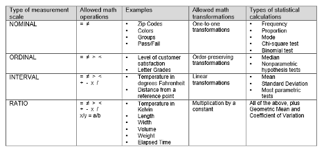
    Spearman’s rho is used when data is ordinal or does not meet the assumptions for Pearson’s r. It measures the strength and direction of the monotonic relationship between two variables.

    The formula for Spearman’s rho is:

    $$\rho = 1 – \frac{6 \sum d_i^2}{n(n^2 – 1)}$$

    Where:

    • $$d_i$$ is the difference between the ranks of corresponding values
    • n is the number of pairs of values

    Example: A researcher wants to study the relationship between a TV show’s IMDB rating and its viewership ranking. They use Spearman’s rho because the data is ordinal. A calculated ρ of 0.85 would indicate a strong positive monotonic relationship between IMDB ratings and viewership rankings.

    Significance and Significance Level

    When interpreting correlation coefficients, it’s crucial to consider their statistical significance[1]. The significance of a correlation tells us whether the observed relationship is likely to exist in the population or if it could have occurred by chance in our sample.

    To test for significance, we typically use a hypothesis test:

    • Null Hypothesis (H0): ρ = 0 (no correlation in the population)
    • Alternative Hypothesis (Ha): ρ ≠ 0 (correlation exists in the population)

    The significance level (α) is the threshold we use to make our decision. Commonly, α = 0.05 is used[3]. If the p-value of our test is less than α, we reject the null hypothesis and conclude that the correlation is statistically significant[4].

    For example, if we calculate a Pearson’s r of 0.75 with a p-value of 0.001, we would conclude that there is a statistically significant strong positive correlation between our variables, as 0.001 < 0.05.

    Understanding correlation and its significance is essential for media students to interpret research findings, analyze trends, and make data-driven decisions in their future careers.

    The Pearson correlation coefficient (r) is a measure of the strength and direction of the linear relationship between two continuous variables. Here’s how to interpret the results:

    Strength of Correlation

    The absolute value of r indicates the strength of the relationship:

    • 0.00 – 0.19: Very weak correlation
    • 0.20 – 0.39: Weak correlation
    • 0.40 – 0.59: Moderate correlation
    • 0.60 – 0.79: Strong correlation
    • 0.80 – 1.00: Very strong correlation

    Direction of Correlation

    The sign of r indicates the direction of the relationship:

    • Positive r: As one variable increases, the other tends to increase
    • Negative r: As one variable increases, the other tends to decrease

    Interpretation Examples

    • r = 0.85: Very strong positive correlation
    • r = -0.62: Strong negative correlation
    • r = 0.15: Very weak positive correlation
    • r = 0: No linear correlation

    Coefficient of Determination

    The square of r (r²) represents the proportion of variance in one variable that can be explained by the other variable[2].

    Statistical Significance

    To determine if the correlation is statistically significant:

    1. Set a significance level (α), typically 0.05
    2. Calculate the p-value
    3. If p-value < α, the correlation is statistically significant

    A statistically significant correlation suggests that the relationship observed in the sample likely exists in the population[4].

    Remember that correlation does not imply causation, and Pearson’s r only measures linear relationships. Always visualize your data with a scatterplot to check for non-linear patterns[3].

    Citations:
    [1] https://statistics.laerd.com/statistical-guides/pearson-correlation-coefficient-statistical-guide.php
    [2] https://sites.education.miami.edu/statsu/2020/09/22/how-to-interpret-correlation-coefficient-r/
    [3] https://statisticsbyjim.com/basics/correlations/
    [4] https://towardsdatascience.com/eveything-you-need-to-know-about-interpreting-correlations-2c485841c0b8?gi=5c69d367a0fc
    [5] https://datatab.net/tutorial/pearson-correlation
    [6] https://stats.oarc.ucla.edu/spss/output/correlation/


    [super_web_share type=”inline” color=”#2271b1″ text=”Share” icon=”share-icon-1″ style=”default” size=”large” align=”start” ]

  • Type I and Type II errors

    Type I and Type II errors are two statistical concepts that are highly relevant to the media industry. These errors refer to the mistakes that can be made when interpreting data, which can have significant consequences for media reporting and analysis.

    Type I error, also known as a false positive, occurs when a researcher or analyst concludes that there is a statistically significant result, when in fact there is no such result. This error is commonly associated with over-interpreting data, and can lead to false or misleading conclusions being presented to the public. In the media industry, Type I errors can occur when journalists or media outlets report on studies or surveys that claim to have found a significant correlation or causation between two variables, but in reality, the relationship between those variables is weak or non-existent.

    For example, a study may claim that there is a strong link between watching violent TV shows and aggressive behavior in children. If the study’s findings are not thoroughly scrutinized, media outlets may report on this correlation as if it is a causal relationship, potentially leading to a public outcry or calls for increased censorship of violent media. In reality, the study may have suffered from a Type I error, and the relationship between violent TV shows and aggressive behavior in children may be much weaker than initially suggested.

    Type II error, also known as a false negative, occurs when a researcher or analyst fails to identify a statistically significant result, when in fact there is one. This error is commonly associated with under-interpreting data, and can lead to important findings being overlooked or dismissed. In the media industry, Type II errors can occur when journalists or media outlets fail to report on studies or surveys that have found significant correlations or causations between variables, potentially leading to important information being missed by the public.

    An example of a Type II error in the media industry could be conducting a study on the impact of a certain type of advertising on consumer behavior, but failing to detect a statistically significant effect, even though there may be a true effect present in the population.

    For instance, a media company may conduct a study to determine if their online ads are more effective than their TV ads in generating sales. The study finds no significant difference in sales generated by either type of ad. However, in reality, there may be a significant difference in sales generated by the two types of ads, but the sample size of the study was too small to detect this difference. This would be an example of a Type II error, as a significant effect exists in the population, but was not detected in the sample studied.

    If the media company makes decisions based on the results of this study, such as reallocating their advertising budget away from TV ads and towards online ads, they may be making a mistake due to the failure to detect the true effect. This could lead to missed opportunities for revenue and reduced effectiveness of their advertising campaigns.

    In summary, a Type II error in the media industry could occur when a study fails to detect a significant effect that is present in the population, leading to potential missed opportunities and incorrect decision-making.

    To avoid Type I and Type II errors in the media industry, here are some suggestions:

    1. Careful study design: It is important to carefully design studies or surveys in order to avoid Type I and Type II errors. This includes considering sample size, control variables, and statistical methods to be used.
    2. Thorough data analysis: Thoroughly analyzing data is crucial in order to identify potential errors or biases. This can include using appropriate statistical methods and tests, as well as conducting sensitivity analyses to assess the robustness of findings.
    3. Peer review: Having studies or reports peer-reviewed by experts in the field can help to identify potential errors or biases, and ensure that findings are accurate and reliable.
    4. Transparency and replicability: Being transparent about study methods, data collection, and analysis can help to minimize the risk of errors or biases. It is also important to ensure that studies can be replicated by other researchers, as this can help to validate findings and identify potential errors.
    5. Independent verification: Independent verification of findings can help to confirm the accuracy and validity of results. This can include having studies replicated by other researchers or having data analyzed by independent experts.

    By following these suggestions, media professionals can help to minimize the risk of Type I and Type II errors in their reporting and analysis. This can help to ensure that the public is provided with accurate and reliable information, and that important decisions are made based on sound evidence

  • Introduction into Statistics ( Chapter 2 and 3)

    Howitt and Cramer Chapter 2 and 3
    Variables, concepts, and models form the foundation of scientific research, providing researchers with the tools to investigate complex phenomena and draw meaningful conclusions. This essay will explore these elements and their interrelationships, as well as discuss levels of measurement and the role of statistics in research.

    Concepts and Variables in Research

    Research begins with concepts – abstract ideas or phenomena that researchers aim to study. These concepts are often broad and require further refinement to be measurable in a scientific context[5]. For example, “educational achievement” is a concept that encompasses various aspects of a student’s performance and growth in an academic setting.

    To make these abstract concepts tangible and measurable, researchers operationalize them into variables. Variables are specific, measurable properties or characteristics of the concept under study. In the case of educational achievement, variables might include “performance at school” or “standardized test scores.”

    Types of Variables

    Research typically involves several types of variables:

    1. Independent Variables: These are the factors manipulated or controlled by the researcher to observe their effects on other variables. For instance, in a study on the impact of teaching methods on student performance, the teaching method would be the independent variable.
    2. Dependent Variables: These are the outcomes or effects that researchers aim to measure and understand. In the previous example, student performance would be the dependent variable, as it is expected to change in response to different teaching methods.
    3. Moderating Variables: These variables influence the strength or direction of the relationship between independent and dependent variables. For example, a student’s motivation level might moderate the effect of study time on exam performance.
    4. Mediating Variables: These variables help explain the mechanism through which an independent variable influences a dependent variable. For instance, increased focus might mediate the relationship between coffee consumption and exam performance.
    5. Control Variables: These are factors held constant to ensure they don’t impact the relationships being studied.

    Conceptual Models in Research

    A conceptual model is a visual representation of the relationships between variables in a study. It serves as a roadmap for the research, illustrating the hypothesized connections between independent, dependent, moderating, and mediating variables.

    Conceptual models are particularly useful in testing research or studies examining relationships between variables. They help researchers clarify their hypotheses and guide the design of their studies.

    Levels of Measurement

    When operationalizing concepts into variables, researchers must consider the level of measurement. There are four primary levels of measurement:

    1. Nominal: Categories without inherent order (e.g., gender, ethnicity).
    2. Ordinal: Categories with a meaningful order but no consistent interval between levels (e.g., education level).
    3. Interval: Numeric scales with consistent intervals but no true zero point (e.g., temperature in Celsius).
    4. Ratio: Numeric scales with consistent intervals and a true zero point (e.g., age, weight).

    Understanding the level of measurement is crucial as it determines the types of statistical analyses that can be appropriately applied to the data.

    The Goal and Function of Statistics in Research

    Statistics play a vital role in research, serving several key functions:

    1. Data Summary: Statistics provide methods to condense large datasets into meaningful summaries, allowing researchers to identify patterns and trends.
    2. Hypothesis Testing: Statistical tests enable researchers to determine whether observed effects are likely to be genuine or merely due to chance.
    3. Estimation: Statistics allow researchers to make inferences about populations based on sample data.
    4. Prediction: Statistical models can be used to forecast future outcomes based on current data.
    5. Relationship Exploration: Techniques like correlation and regression analysis help researchers understand the relationships between variables.

    The overarching goal of statistics in research is to provide a rigorous, quantitative framework for drawing conclusions from data. This framework helps ensure that research findings are reliable, reproducible, and generalizable.

  • Shapes of Distributions (Chapter 5)

    Probability distributions are fundamental concepts in statistics that describe how data is spread out or distributed. Understanding these distributions is crucial for students in fields ranging from social sciences to engineering. This essay will explore several key types of distributions and their characteristics.

    Normal Distribution

    The normal distribution, also known as the Gaussian distribution, is one of the most important probability distributions in statistics[1]. It is characterized by its distinctive bell-shaped curve and is symmetrical about the mean. The normal distribution has several key properties:

    1. The mean, median, and mode are all equal.
    2. Approximately 68% of the data falls within one standard deviation of the mean.
    3. About 95% of the data falls within two standard deviations of the mean.
    4. Roughly 99.7% of the data falls within three standard deviations of the mean.

    The normal distribution is widely used in natural and social sciences due to its ability to model many real-world phenomena.

    Skewness

    Skewness is a measure of the asymmetry of a probability distribution. It indicates whether the data is skewed to the left or right of the mean[6]. There are three types of skewness:

    1. Positive skew: The tail of the distribution extends further to the right.
    2. Negative skew: The tail of the distribution extends further to the left.
    3. Zero skew: The distribution is symmetrical (like the normal distribution).

    Understanding skewness is important for students as it helps in interpreting data and choosing appropriate statistical methods.

    Kurtosis

    Kurtosis measures the “tailedness” of a probability distribution. It describes the shape of a distribution’s tails in relation to its overall shape. There are three main types of kurtosis:

    1. Mesokurtic: Normal level of kurtosis (e.g., normal distribution).
    2. Leptokurtic: Higher, sharper peak with heavier tails.
    3. Platykurtic: Lower, flatter peak with lighter tails.

    Kurtosis is particularly useful for students analyzing financial data or studying risk management[6].

    Bimodal Distribution

    A bimodal distribution is characterized by two distinct peaks or modes. This type of distribution can occur when:

    1. The data comes from two different populations.
    2. There are two distinct subgroups within a single population.

    Bimodal distributions are often encountered in fields such as biology, sociology, and marketing. Students should be aware that the presence of bimodality may indicate the need for further investigation into underlying factors causing the two peaks[8].

    Multimodal Distribution

    Multimodal distributions have more than two peaks or modes. These distributions can arise from:

    1. Data collected from multiple distinct populations.
    2. Complex systems with multiple interacting factors.

    Multimodal distributions are common in fields such as ecology, genetics, and social sciences. Students should recognize that multimodality often suggests the presence of multiple subgroups or processes within the data.

    In conclusion, understanding various probability distributions is essential for students across many disciplines. By grasping concepts such as normal distribution, skewness, kurtosis, and multi-modal distributions, students can better analyze and interpret data in their respective fields of study. As they progress in their academic and professional careers, this knowledge will prove invaluable in making informed decisions based on statistical analysis.

  • Univariate Analysis: Understanding Measures of Central Tendency and Dispersion

    Univariate analysis is a statistical method that focuses on analyzing one variable at a time. In this type of analysis, we try to understand the characteristics of a single variable by using various statistical techniques. The main objective of univariate analysis is to get a comprehensive understanding of a single variable, its distribution, and its relationship with other variables. 

    Measures of Central Tendency 

     Measures of central tendency are statistical measures that help us to determine the center of a dataset. They give us an idea of where most of the data lies and what is the average value of a dataset. There are three main measures of central tendency: mean, median, and mode. 

    1. Mean The mean, also known as the average, is calculated by adding up all the values of a dataset and then dividing the sum by the total number of values. It is represented by the symbol ‘μ’ (mu) in statistics. The mean is the most commonly used measure of central tendency. 
    1. Median The median is the middle value of a dataset when the data is arranged in ascending or descending order. If the number of values in a dataset is odd, the median is the middle value. If the number of values is even, the median is the average of the two middle values. 
    1. Mode The mode is the value that appears most frequently in a dataset. It is the most common value in a dataset. A dataset can have one mode, multiple modes, or no mode. 

    Measures of Dispersion 

    Measures of dispersion are statistical measures that help us to determine the spread of a dataset. They give us an idea of how far the values in a dataset are spread out from the central tendency. There are two main measures of dispersion: range and standard deviation. 

    1. Range The range is the difference between the largest and smallest values in a dataset. It gives us an idea of how much the values in a dataset vary. 
    1. Standard Deviation The standard deviation is a measure of how much the values in a dataset vary from the mean. It is represented by the symbol ‘σ’ (sigma) in statistics. The standard deviation is a more precise measure of dispersion than the range. 

    Conclusion 

    In conclusion, univariate analysis is a statistical method that helps us to understand the characteristics of a single variable. Measures of central tendency and measures of dispersion are two important concepts in univariate analysis that help us to determine the center and spread of a dataset. Understanding these concepts is crucial for analyzing data and making informed decisions.